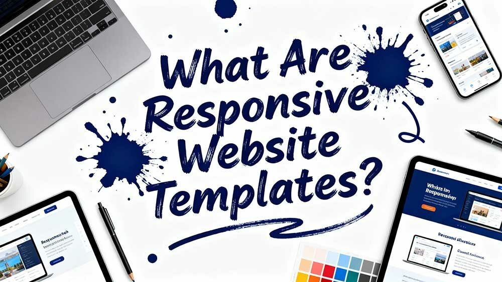
Responsive website templates are digital chameleons that automatically adjust your site’s layout, images, and content to fit any screen size – from smartphones to desktop monitors. They use flexible CSS grids and media queries to rearrange elements seamlessly, ensuring your visitors get a superior experience whether they’re browsing on a 5-inch phone or 27-inch computer.
With Google prioritising mobile-friendly sites and responsive designs enhancing conversion rates by 11%, these templates aren’t just convenient – they’re essential for modern web success. There’s much more to comprehend about implementation and optimisation.
Definition and Core Concepts of Responsive Website Templates
Responsiveness in web design isn’t just a trendy buzzword—it’s the foundation of modern websites that actually work for everyone.
You’re looking at a design approach that makes your website automatically adjust to any device someone uses to visit it.
Your website becomes a digital chameleon, instantly adapting to every screen size and device your visitors use.
Think of responsive templates as digital shapeshifters. They use three core principles established by Ethan Marcotte in 2010: flexible layouts, flexible images, and media queries.
Your content behaves like water filling a container, expanding for desktop screens and shrinking for smartphones without losing functionality.
Here’s what happens behind the scenes: CSS and HTML work together to resize, hide, or rearrange elements based on screen dimensions. This responsive design approach is now essential for Google’s mobile-first indexing, which prioritises mobile-friendly sites in search rankings.
Instead of creating separate mobile versions, you get one website that seamlessly serves everyone. This approach emerged from the need to replace adaptive design strategies that proved ineffective at handling the diverse range of screen sizes in the early 2010s.
Technical Architecture and Implementation Methods
When you delve into the technical foundation of responsive templates, you’ll uncover a complex ecosystem of CSS structures, grid systems, and implementation strategies that transform static designs into fluid, device-agnostic experiences.
You’ve got two primary approaches: fully responsive designs that adapt like water to any container, or responsive layouts that shift at predetermined breakpoints.
Bootstrap’s grid system leads in this arena, providing twelve-column flexibility that has become an industry standard.
Foundation offers comparable capabilities with enhanced customisation options.
The hybrid approach merges traditional HTML/CSS scaffolding with embedded components.
Coarse-grain elements such as headers and routing utilise standard markup, whilst fine-grain components—polls, carousels, article lists—harness structural power.
This method provides faster loading times and simpler maintenance compared to fully responsive implementations. Page templates define the outer structure to ensure consistent branding across your entire responsive framework.
Responsive Vs Adaptive Design Approaches
Beyond the technical structures and grid systems lies a fundamental choice that will shape your entire development approach: responsive versus adaptive design strategies.
Here’s what separates them: responsive design uses one fluid layout that rearranges based on screen size, whilst adaptive design employs multiple fixed layouts that change at specific breakpoints.
You’ll find adaptive sites perform 2-3 times faster on speed tests because they deliver device-specific resources rather than forcing every device to download everything. This speed improvement can be crucial for South African users dealing with varying connection speeds across different regions.
However, responsive design requires considerably less work to build and maintain. You won’t need separate HTML and CSS code for each layout as adaptive designs demand.
Responsive design streamlines development with a single codebase, eliminating the need for multiple device-specific layouts.
That said, adaptive design gives you more control over each layout’s functionality and guarantees a consistent user experience across different resolutions. This approach suits businesses targeting diverse South African markets where users access content through vastly different devices and network conditions.
Responsive design utilises CSS media queries to inspect device characteristics and automatically adapt the layout to any screen size.

Media Handling and Content Optimisation
You’ll need to perfect three critical media optimisation techniques to ensure your responsive template performs flawlessly across all devices.
Flexible image implementation keeps your visuals sharp while preventing layout breaks.
Video scaling techniques maintain smooth playback without bandwidth issues.
High-resolution graphics optimisation delivers crisp displays without sacrificing loading speed. With 94.22% of website templates now being responsive, these media handling strategies work together to create that seamless user experience your visitors expect, whether they’re browsing on a smartphone or a 4K desktop monitor.
Just like ongoing maintenance ensures your website stays secure and functional, proper media optimisation requires continuous attention to keep your responsive design performing at its best.
These media handling strategies work together to create that seamless user experience your visitors expect, whether they’re browsing on a smartphone or a 4K desktop monitor.
Flexible Image Implementation
Although modern browsers have made significant advancements in handling responsive design, images remain one of the trickiest elements to implement correctly across different screen sizes.
You’ll need to master CSS properties that make images truly flexible. Setting `max-width: 100%` guarantees your images fit their containers, whilst `height: auto` maintains proper aspect ratios during scaling.
Here’s your essential implementation checklist:
- Use `srcset` attribute to deliver appropriate images for each screen size
- Apply CSS `max-width: 100%` and `height: auto` for flexible scaling
- Create multiple image versions: 640px-768px (mobile), 1024px-1280px (tablets), 1920px-2560px (desktops)
- Compress images before uploading using tools like Squoosh
- Include descriptive alt text for accessibility compliance
This mobile-first approach prevents distortion and maintains visual quality across devices.
Video Scaling Techniques
While images can challenge your responsive design skills, videos present an entirely different level of complexity that will test your CSS fundamentals. You will need strategic approaches to prevent videos from breaking your layouts.
| Property | Value | Purpose |
|---|---|---|
| max-width | 100% | Prevents container overflow |
| width | 100% | Enables full scaling |
| height | 100% | Maintains proportions |
| position | absolute | Anchors video placement |
| padding-bottom | 56.25% | Creates 16:9 aspect ratio |
Start with CSS max-width set to 100% – this prevents videos from overflowing responsive containers.
For aspect ratio control, use the padding-bottom trick: 56.25% creates perfect 16:9 containers. Media queries become essential at breakpoints like 768px, adjusting padding-bottom to 75% for mobile screens.
Bootstrap’s ratio helper classes simplify this process considerably.
High-Resolution Graphics Optimisation
Beyond video challenges, high-resolution displays create even more demanding requirements for your graphics optimisation strategy.
Retina displays need 2x or 3x resolution images to maintain crisp visuals, but this dramatically increases file sizes.
Here’s your essential optimisation toolkit:
- Use srcset attribute to serve appropriate image resolutions based on device pixel ratio
- Implement WebP and AVIF formats for superior compression over traditional JPG/PNG
- Apply lazy loading to delay image loading until users actually need them
- Remove image metadata and compress files using tools like TinyPNG
- Utilise CDNs to deliver images from geographically closer servers
A 320px image weighs 39KB while its 640px counterpart hits 93KB.
That’s a significant performance impact when multiplied across your entire site.
Smart format selection and compression techniques maintain visual quality while keeping load times reasonable for South African users.
Navigation and User Interface Adaptations
Three critical interface adjustments separate successful responsive websites from those that frustrate users across devices.
First, you’ll need touch-friendly elements with minimum 48×48 pixel dimensions and 32px spacing. This prevents those annoying accidental taps that make users want to throw their phones.
Your text must stay at least 16px for readability, whilst maintaining 4.5:1 colour contrast ratios for accessibility compliance.
Second, routing patterns matter enormously. Accordion menus work brilliantly for multi-level structures, whilst curtain routing handles two to three levels effectively.
Avoid slide-in menus—they’re sluggish and distracting.
Finally, implement three to five responsive breakpoints covering mobile, tablet, and desktop configurations. Use flexbox-based auto-layout systems for automatic component resizing.
Always provide visual feedback through colour changes and current location indicators.
Benefits and Business Impact
When you implement responsive website templates, the financial impact hits your bottom line immediately—with conversion rates jumping 11% higher than non-responsive alternatives.
The business case becomes even stronger when you examine mobile performance specifically. Mobile-optimised templates deliver 60% higher conversion rates on mobile devices, while poor usability drives away 79% of visitors entirely.
Your return on investment extends beyond immediate sales:
- Cost savings: Templates reduce design expenses by 50-70% compared to custom development.
- User retention: Mobile-friendly design increases repeat visits by 75%.
- Search visibility: Responsive design improves mobile search rankings by 50%.
- Market positioning: 88% of users return to sites offering positive browsing experiences.
- Revenue growth: Over half of South African businesses report increased sales after adopting responsive design.
These benefits multiply when combined with proper SEO optimisation, as higher Google rankings directly translate to increased visibility and traffic quality for mobile-ready sites.
CSS Media Queries and Breakpoint Strategies
You’ll need to become proficient in CSS media queries and breakpoint strategies to make your responsive templates work across every device your users own.
The most effective approach starts with comprehending common breakpoint standards like 600px for mobile-to-tablet changes and 768px for tablet-to-desktop alterations.
When you implement these media queries correctly, you’re fundamentally creating multiple versions of your design that activate based on screen size—think of it as having a smart wardrobe that automatically picks the right outfit for each occasion.
Common Breakpoint Standards
While device manufacturers continue releasing screens in every conceivable size, responsive design relies on a set of standard breakpoint values that have emerged through years of practical testing and industry consensus.
You’ll find these breakpoints consistently across frameworks and professional projects throughout South Africa and internationally.
- 640px (Small): Mobile devices and narrow viewports
- 768px (Medium): Tablets in portrait orientation
- 1024px (Large): Laptops and tablets in horizontal mode
- 1280px (Extra Large): Standard desktop displays
- 1536px (Ultra-wide): Modern widescreen monitors
These aren’t arbitrary numbers—they’re battle-tested thresholds where content naturally breaks down without intervention.
Popular frameworks like Tailwind CSS and Bootstrap have standardised these values, making them reliable starting points for South African developers and international teams alike.
You can customise them based on your specific content needs. However, these standards provide a solid foundation that’ll work for 90% of your projects, whether you’re building for Cape Town startups or Johannesburg enterprises.
Media Query Implementation
After establishing your breakpoint strategy, the real work begins with CSS media queries—the technical backbone that converts those carefully chosen breakpoints into responsive behaviour.
You’ll structure media queries using the @media rule, which tests conditions before applying CSS rules. The syntax follows a simple pattern: `@media (min-width: 768px) { /* styles */ }`. This creates responsive layouts that adjust seamlessly.
Here’s your essential media query toolkit:
| Feature | Mobile First | Desktop First |
|---|---|---|
| Base Styles | 320px+ | 1200px+ |
| Tablet | min-width: 768px | max-width: 1023px |
| Desktop | min-width: 1024px | max-width: 767px |
| Large Screen | min-width: 1440px | max-width: 1439px |
| @media print | @media print |
Always place media queries adjacent to related CSS components. You’ll thank yourself during maintenance. This approach keeps your code organised and maintainable.
Fluid Grid Systems and Layout Flexibility
When building responsive websites that actually work across devices, fluid grid systems form the backbone of flexible layouts that change seamlessly to any screen size.
Instead of struggling with rigid pixel measurements, you’ll use percentage-based columns that automatically adjust to different viewports.
Modern CSS Grid and Flexbox make this implementation surprisingly straightforward. These tools work exceptionally well for South African businesses aiming to reach customers across diverse device types.
CSS Grid handles complex two-dimensional layouts without extensive media queries.
Flexbox manages simple one-dimensional arrangements effectively.
Relative units (percentages, em, rem) replace fixed pixel measurements.
Viewport units ensure consistent proportions across screen dimensions.
Flexible gutters maintain proper spacing using relative measurements.
The target-divided-by-context formula converts pixel designs into percentage-based layouts.
You’ll add breakpoints only when content looks problematic, not for every possible device size.
Mobile-First Design Principles
Since mobile devices now generate 62% of all web traffic, you’ll need to flip your entire design approach upside down.
Mobile-first design starts with your smallest screen and scales up—not down from desktop.
You’ll prioritise essential content first, then add extras for larger screens. This approach naturally creates faster, cleaner experiences because you’re designing for slower connections and limited screen space from day one.
Your buttons need to be large enough for thumbs, not mouse cursors. Space interactive elements properly to prevent accidental taps.
Keep text short and punchy—mobile users don’t have patience for desktop-length paragraphs.
Most importantly, think touch-first. Swipes replace hover effects, taps replace clicks. When 96% of users browse on phones, mobile-first isn’t optional anymore. Professional web designers understand that flexible, responsive capabilities are essential for accommodating the diverse needs of modern audiences across all devices.
Cross-Device Compatibility Testing
You’ve built a stunning responsive template, but here’s the reality check – it needs to work flawlessly across every device your users might grab.
Testing your template on multiple devices and browsers isn’t optional when 65% of internet traffic comes from mobile devices and 40% of users will abandon your site after poor mobile performance.
Your testing strategy must cover both device compatibility methods and browser verification processes to guarantee your template delivers consistent experiences whether someone’s using an iPhone 14, Samsung Galaxy, or that ancient laptop running Internet Explorer.
Device Testing Methods
Three critical approaches form the backbone of effective cross-device compatibility testing: manual testing on physical devices, mechanised systems that scale across multiple platforms, and cloud-based solutions that provide instant access to hundreds of device configurations.
Manual testing remains essential for critical user flows in the South African market. You’ll want to focus on devices that capture your highest traffic first, particularly those commonly used across South Africa’s diverse mobile landscape.
Browser developer tools can emulate different screen sizes. However, nothing beats real device testing for authentic user experiences.
Automated systems like Selenium simplify repetitive tasks across multiple browsers and devices. Here’s what you should prioritise:
- Install various browser versions on Linux systems for thorough coverage
- Implement parallel testing to run multiple tests simultaneously
- Integrate continuous testing into your development workflow
- Focus manual efforts on key functionalities and user paths
- Employ cloud platforms like CrossBrowserTesting for instant device access
Cloud-based testing solutions offer South African developers cost-effective access to extensive device libraries.
These platforms eliminate the need for maintaining expensive physical device labs while ensuring comprehensive coverage across Android and iOS devices popular in the local market.
Browser Compatibility Verification
While device testing confirms your responsive templates work across various screen sizes, browser compatibility verification ensures they actually function properly for real users navigating with different browsers and operating systems.
You’ll need thorough testing across multiple platforms. BrowserStack provides access to over 3,000 real devices and browsers, while CrossBrowserTesting offers 1,500+ combinations starting at R520 per month. These platforms eliminate guesswork through real device testing rather than unreliable emulators.
Focus your efforts strategically:
- Prioritise by traffic – Test browsers your analytics show users actually use
- Automate repetitive checks – Selenium handles Firefox and Chrome testing on Linux systems efficiently
- Capture visual proof – Screenshot comparison tools reveal layout inconsistencies across different browsers
Real device testing provides accurate performance validation that simulators simply can’t match. Professional web development teams detect and correct browser compatibility issues during the coding process to ensure website reliability across all platforms.
Performance Optimisation for Multiple Devices
When your beautifully designed responsive website crawls like treacle on a smartphone but races through loading on desktop, you’re facing the classic multi-device performance puzzle.
You’ll need strategic optimisation techniques that adapt to each device’s unique constraints. These strategies are particularly vital in the South African market where mobile data costs can significantly impact user experience.
- Implement lazy loading for images so they only load when users scroll to them, preventing overloading mobile connections.
- Compress images rigorously using webpack plugins or online tools without sacrificing visual quality. This is essential for users on limited data bundles.
- Minify CSS and JavaScript by removing unnecessary whitespace, comments, and characters that slow down downloads.
- Prioritise above-the-fold content so critical elements like headlines and calls-to-action appear instantly. Mobile users in South Africa often browse on slower connections and need immediate visual feedback.
- Enable browser caching with proper expiration headers, storing static resources locally for repeat visits.
These optimisations ensure your responsive template performs consistently across smartphones, tablets, and desktops. Professional web design agencies implement these performance optimisation techniques to ensure websites achieve top Google rankings while maintaining fast loading speeds across all devices.
The improved loading speeds will reduce data consumption costs for your South African users while upholding professional presentation standards.
Choosing the Right Responsive Template for Your Needs
Performance optimisation sets the technical foundation, but selecting the wrong template will undermine even the most carefully tuned website. You need to match your template choice to your specific purpose and industry requirements.
Start by identifying your website’s primary function. E-commerce templates include built-in shopping basket functionality, while portfolio templates showcase creative work effectively. Blog templates emphasise reading experience, and business templates project professional credibility.
Next, evaluate technical compatibility. Your template must work with your hosting provider’s infrastructure and support mobile-first design principles. Look for flexible grids that adjust naturally across screen sizes, with media queries set at standard breakpoints like 480, 768, and 1024 pixels.
Finally, consider long-term support. Choose templates from reputable sources that provide regular updates and customer assistance.
Frequently Asked Questions
Can I Convert My Existing Non-Responsive Website to Use Responsive Templates?
Yes, you can convert your existing website to responsive templates, but it’s challenging. You’ll need to rewrite most code, reorganise content, and use CSS media queries. Consider creating duplicate files before starting conversion.
Do Responsive Templates Affect Search Engine Rankings and SEO Performance?
Yes, responsive templates significantly improve your SEO performance and search rankings. You’ll notice 50% better mobile search rankings, 20% lower bounce rates, and higher conversion rates as Google prioritises mobile-friendly sites.
What Are the Most Popular Platforms for Downloading Responsive Website Templates?
You’ll find the most popular platforms are TemplateMo with 588+ templates, Colorlib featuring 70+ designs, Tooplate offering 60+ Bootstrap templates, StyleShout providing professional themes, and WPAstra with 300+ designer-made options.
How Long Does It Take to Customise a Responsive Template?
You’ll typically need 8-12 weeks to customise a responsive template with your branding, colours, and content. Basic modifications can be completed within days, while complex graphics and cross-device testing extend timelines.