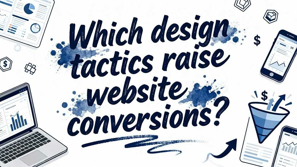
You’ll significantly boost conversions by implementing personalised CTAs that convert 202% better than generic buttons, harnessing user-generated content and social proof that 88% of consumers trust as much as personal recommendations, and optimising page speed since every second of delay reduces conversions by 4.42%. Strategic white space enhances readability by 35%, whilst authentic urgency tactics and mobile-first design with touch-friendly elements complete the formula for maximising results through these proven optimisation techniques.
Key Takeaways
- Personalised CTAs tailored to industry language and buyer stage boost lead conversion by 42% compared to generic buttons.
- User-generated content like customer reviews and photos increases engagement by 102% and conversions by 29%.
- Page load speeds under 3 seconds prevent 50% bounce rate increases, with sub-1 second loads achieving 2.5x higher conversions.
- Strategic white space and visual hierarchy improve readability by 35% while directing attention to key conversion elements.
- Authentic urgency tactics like “Only 3 left” and credible countdown timers outperform generic versions by 23%.
Personalised Call-to-Action Buttons That Convert 202% Better
Two-thirds of South African businesses still rely on generic “Click Here” and “Learn More” buttons, fundamentally leaving a 202% conversion enhancement sitting on the table. You’re essentially ignoring your local audience’s specific needs, interests, and buying stage.
Personalised CTAs work because they speak directly to where your South African visitor stands. When you tailor buttons to industry-specific language or buyer journey position, you’ll see 42% more visitors convert into leads. It’s not magic—it’s relevance. Aligning your CTAs with your corporate identity design ensures that the visual and verbal messaging resonates with your brand’s values and audience expectations.
Start with three basic personalisation layers: industry terminology, visitor behaviour, and purchase intent.
A South African SaaS prospect responds better to “Start Your Free Trial” than “Learn More.”
An existing customer needs “Upgrade Now” instead of generic discovery language.
Dynamic personalisation tools can enable this process, but manual segmentation works equally well for local businesses. This data-driven approach replaces guesswork with measurable results, allowing you to identify exactly which CTA variations perform best for your South African market segments.
Consider local context in your CTAs.
A Cape Town-based financial services visitor might respond to “Get Your Quote in Minutes,” whilst a Johannesburg manufacturing prospect prefers “Schedule Your Site Assessment.”
Understanding regional business culture and local market nuances makes your calls-to-action resonate with South African decision-makers.
User-Generated Content and Social Proof Elements That Build Trust
Building trust through personalised CTAs is just the beginning—you’ll need genuine social proof to convince South African visitors that your business actually delivers on its promises. User-generated content transforms sceptical browsers into confident buyers because 88% of consumers trust peer reviews as much as personal recommendations. Partnering with a skilled agency can amplify this trust by ensuring your website effectively showcases authentic content like reviews and testimonials through responsive design. Incorporating user-generated content not only builds credibility but also serves as a benchmark for your website’s design. By utilizing the design secrets of top websites, you can create a seamless user experience that encourages engagement and fosters loyalty. This strategic approach can set your business apart in the competitive digital landscape, making it more likely for visitors to convert into customers.
| UGC Type | Conversion Impact | Trust Factor |
|---|---|---|
| Customer Reviews | +102.4% interaction lift | 88% trust rate |
| Visual Content | 90% longer site visits | 85% preference over branded |
| Employee Posts | 2x higher engagement | 10x larger reach |
| Real-time Stats | Creates urgency | Builds authority |
You’re sitting on a goldmine—48% of customers discover new products through UGC. Display reviews prominently, showcase customer photos, and watch conversions climb 29% higher than sites without social proof. When shoppers see real customer photos instead of polished stock images, 80% prefer this authentic approach that demonstrates actual product use.
Page Load Speed Optimisation for Maximum User Retention
When your page takes longer than three seconds to load, you’re practically handing conversions to your competitors on a silver platter. Here’s the harsh reality: every second of delay costs you 4.42% in conversions, and that 3-second threshold triggers a devastating 50% spike in bounce rates.
Your optimisation arsenal should include:
- Media compression – Lazy load images and videos to slash bandwidth demands
- Code minification – Strip unnecessary CSS/JS bloat that’s slowing processing
- CDN implementation – Distribute content globally for lightning-fast delivery across Africa and internationally
- Strategic caching – Eliminate redundant data fetching with server-side solutions
The payoff? Sub-1-second loads deliver 2.5x higher e-commerce conversions than 5-second loads. Beyond the conversion metrics, faster websites foster user trust and loyalty while poorly performing sites damage brand perception and push customers towards competitors. Partnering with experts can ensure your site achieves these critical speed benchmarks through tailored digital strategies.
For a R180M business, that speed enhancement translates to R3.6M+ in additional annual revenue.
Strategic White Space and Visual Hierarchy Design Principles
You’ve refined your page speed, but if visitors can’t quickly identify what matters most on your screen, you’re still losing conversions.
Strategic white space isn’t just empty pixels—it’s your secret weapon for directing attention to CTAs and creating visual breathing room that actually guides purchasing decisions.
Dominate these spacing fundamentals and hierarchy techniques, and you’ll revolutionise cluttered pages into conversion machines that effortlessly lead users towards your desired actions.
Effective graphic design leverages visual hierarchy principles to ensure that key elements stand out and guide user focus seamlessly. By utilizing colors, sizes, and layout effectively, designers can create an intuitive flow that enhances user experience. Incorporating proactive design strategies for users not only simplifies navigation but also creates a more engaging interaction with the content. This thoughtful approach encourages users to explore further, ultimately leading to a more satisfying browsing experience. By understanding these principles, designers can create layouts that not only attract attention but also convey information effectively. When considering how to select a design partner, it is crucial to evaluate their expertise in applying these principles to ensure your project achieves its intended goals. A strong partnership in design can lead to innovative solutions that resonate with your target audience.
White Space Conversion Impact
Although many website owners obsess over flashy graphics and complex animations, the simple act of strategically placing white space around your key conversion elements can enhance your results by up to 35%. Here’s what actually drives results:
Readability equals revenue. Eleven percent of conversion success connects directly to readability scores, and white space reduces cognitive overload that kills decision-making.
Focus drives action. When you isolate CTAs from competing elements, you’re guiding attention where it matters most.
E-commerce sites see dramatic improvements by decluttering product pages—users make faster, more confident purchasing decisions. By streamlining the presentation of products and removing unnecessary distractions, retailers can create a more intuitive shopping experience. This approach not only enhances user satisfaction but also aligns with strategies to maximize ecommerce sales techniques, ultimately boosting conversion rates. Simplifying navigation and focusing on key product features can further facilitate buyer confidence and drive repeat purchases.
Mobile responsiveness matters. Thirty to forty-one percent of users abandon cluttered sites immediately. Strategic white space simplifies mobile interfaces, preventing the interface chaos that destroys conversions across devices.
Visual Hierarchy Best Practices
Strategic visual hierarchy reshapes confusing websites into conversion machines—but most designers treat it like decorating instead of engineering user behaviour.
You’re establishing dominance through calculated design choices. High-contrast CTAs demand attention using bold colours that differentiate from your background palette. Apply the 2:2:1 font ratio—22px body text, 44px headers, 88px CTAs—for instant readability.
| Element | Primary Focus | Secondary Focus |
|---|---|---|
| Colour Contrast | Bold CTA colours | Muted backgrounds |
| Typography | 88px CTA text | 44px headers |
| Spacing | White space pools | Content grouping |
| Motion | Subtle CTA animations | Static elements |
| Positioning | Above-fold placement | Supporting content |
Structure content in horizontal priority tiers: hero, core content, footer CTAs. Use directional elements like arrows to guide eye paths, while empty space anchoring isolates critical elements from visual noise.
Urgency and Scarcity Tactics That Drive Immediate Action
When clients hesitate during payment, you’re losing money moment by moment through change and via shifting circumstances—and that’s exactly where immediacy and limited availability strategies become your most powerful persuasive tools.
Real inventory displays (“Only 3 left”) create genuine pressure without manipulation. You’ll notice conversions increase sharply when customers see authentic scarcity signals.
Authentic scarcity signals prompt immediate action—genuine inventory alerts generate urgency that turns browsers into buyers without feeling coercive.
Live shopper metrics enhance this effect—”11 users viewing this item” turns browsing into competitive decision-making. This real-time data not only increases urgency but also taps into the social proof psychology, nudging users towards making quicker purchases. As these dynamics evolve, they will shape future ecommerce design trends in sa, prompting businesses to innovate in how they connect with consumers. Enhancing user experiences through interactive elements and personalized recommendations will become essential in adapting to these trends.
Countdown timers are effective, but they must seem credible. *Variable* CTAs like “Claim Now Before Midnight” outperform generic buttons by 23%. Flash sales require visual prominence and clear expiration dates.
Social proof notifications (“Just purchased in Cape Town 2 minutes ago”) build momentum whilst emphasising limited availability.
Stack value through VIP early access and bundle offers with strict deadlines.
These tactics succeed because they reflect real purchasing psychology—scarcity drives action when Mzansi consumers perceive genuine value opportunities slipping away.
Mobile-First Design Approaches for Seamless User Experience
Your mobile visitors won’t hang about for cumbersome interfaces or slow-loading pages—they’ll simply move on to a competitor who’s got their act together.
That’s why you need to focus on three critical elements that separate winning mobile experiences from the ones that lose customers: optimised checkout flows, lightning-fast page speeds, and touch-friendly design elements.
Get these fundamentals right, and you’ll turn frustrated mobile browsers into paying customers.
Simplified Checkout Processes
Mobile checkout abandonment rates hover around 70%, and the culprit isn’t always complicated—it’s often your checkout process itself. You’re losing sales every time someone encounters unnecessary friction during those final, essential moments.
The solution lies in ruthless simplification. Reduce your checkout to four steps maximum, eliminate guest registration requirements, and implement one-page designs wherever possible. Your forms should trigger appropriate keyboards automatically—numeric for phone numbers and ID numbers, email-specific for addresses.
| Optimisation Area | Before | After |
|---|---|---|
| Field Count | 15+ inputs | 8-10 simplified |
| Steps Required | 6-8 pages | 3-4 maximum |
| Input Spacing | Cramped layout | 48px vertical gaps |
| Error Handling | Post-submit only | Real-time validation |
Position your primary CTA above the fold with contrasting colours, and watch those conversion rates climb. Consider integrating popular South African payment methods like SnapScan, Zapper, and EFT alongside traditional card payments to reduce checkout friction for local customers.
Mobile Page Speed
Although mobile users expect lightning-fast experiences, most websites still treat speed as an afterthought—a costly mistake when every second directly impacts your bottom line. You’re losing 7% of conversions with just one-second delays, and 53% of mobile users abandon pages that don’t load within three seconds.
Start by optimising your critical render path. Prioritise above-the-fold content while implementing lazy loading for images below the fold. Use WebP formats and compress images aggressively—quality loss is minimal, file size reduction is massive.
Deploy server-side rendering for faster initial content display. Minify your CSS and JavaScript, then serve everything through a CDN. Critical CSS should be inline; defer non-essential scripts using async attributes.
These optimisations refine sluggish pages into conversion machines.
Touch-Friendly Interface Elements
Touch-Friendly Interface Elements
Speed means nothing if users can’t actually interact with your site once it loads. Your buttons need to work flawlessly under thumb pressure, or you’ll watch conversions disappear faster than your loading time improvements.
Start with proper button sizing—44×44 pixels minimum prevents those frustrating mis-taps that send users scrambling for the back button. Place your CTAs in thumb-friendly zones, typically the lower third of screens where natural grip positioning occurs.
| Element | Mobile Requirement |
|---|---|
| Button Size | Minimum 44x44px |
| Touch Padding | 10-12px spacing |
| CTA Placement | Lower screen third |
| Menu Style | Hamburger/collapsible |
Simplify your navigation with collapsible menus and prioritise vertical scrolling over horizontal swiping. Add micro-interactions like subtle vibration or animation feedback—users need confirmation their taps registered successfully.
Content Structure Techniques That Guide Users to Convert
Why do some websites effortlessly guide visitors towards conversion while others watch potential customers vanish into the digital void? The answer lies in strategic content structure that *transforms* casual browsers into committed buyers.
Your content *architecture* determines conversion success. Short paragraphs and bullet points *enhance* readability—crucial when mobile delays of just one second reduce conversions by 20%.
*Personalised* content delivers 19% conversion rates versus 2.9% for generic messaging. That’s not coincidence; it’s psychological precision.
Industry-specific content proves essential. Healthcare and legal sites achieve 3-3.4% conversions through *tailored* messaging that matches user intent. SEO-optimised content generates 2.1-2.6% rates by aligning keywords with visitor expectations.
Linear *navigation* reduces cognitive load, creating clear conversion pathways. Remove unnecessary form fields, simplify checkout processes, and watch completion rates soar from 16% to 23%.
Frequently Asked Questions
How Do I Measure Conversion Rate Improvements After Implementing These Design Tactics?
Think of measurement as your design’s heartbeat—track conversion rate formulas before and after implementation, run A/B tests with control groups, analyse heatmaps for user behaviour shifts, and calculate incremental uplift percentages for quantifiable proof.
What Tools Can I Use to A/B Test Different CTA Variations Effectively?
You’ll want Kameleoon for enterprise-grade full-stack testing with machine learning personalisation. It offers heatmaps, session recording, and GDPR compliance. Test button text, colours, and placement while ensuring statistical significance for reliable results.
How Long Should I Run Tests Before Determining Which Design Changes Work?
95% of tests need a minimum of 1-2 weeks to reach statistical significance. You should run your design experiments until you’ve captured complete business cycles, achieved 90-95% confidence levels, and gathered sufficient sample sizes across weekdays and weekends.
What’s the Ideal Conversion Rate Benchmark for My Specific Industry or Niche?
Your ideal benchmark depends on your industry’s complexity and sales cycle. B2C/D2C should target 18-22% MQL-to-SQL rates, whilst B2B aims for 13-15%. Google Ads averages 7.5% across sectors.
How Do I Prioritise Which Design Tactics to Implement First With Limited Resources?
Begin with ICE scoring your tactics, prioritise high-traffic pages first, test simple CTA changes before complex redesigns. You’ll maximise impact while minimising effort, validate assumptions quickly, and build momentum through measurable wins.